Visually representing conference presentations (examples from CNI)
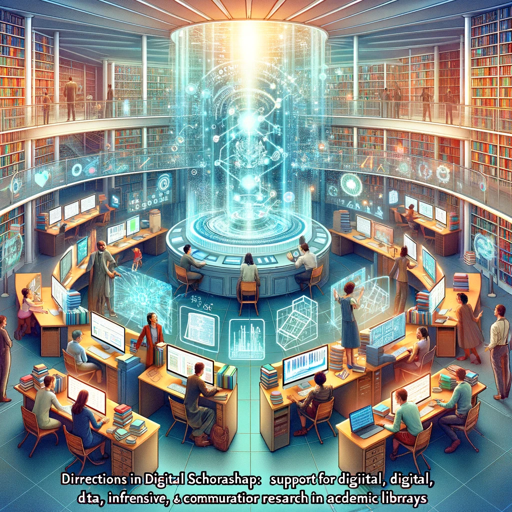
I mentioned using a personal GPT to generate visual interpretations of conference talks in my CNI Insights Agent post. I played around a little more just to test the platform and thought I’d share some of the graphics. The platform struggles with spelling – so don’t read the words! But the visuals are compelling.
Basically, I fed the presentation transcripts into the visual generation tool. Here are a few samples.
This is from a talk I was involved with about CMU’s Robot Archives:
Here is one from a talk about the Digital Borderlands project from the University of Arizona. Shan Sutton, Megan Senseney, Verónica Reyes-Escudero, and Alana Varner.
Here is one from Joan Lippincott: Directions in Digital Scholarship: Support for Digital, Data-Intensive, and Computational Research in Academic Libraries
I wondered about blending talks together. Perhaps a visual conversation? I took the text from the talk above via Joan and combined it with this one: Preserving New Forms of Scholarship from Jonathan Greenberg and Karen Hanson.
And lastly. Let’s take this to the extreme. I generated these visuals collectively for all of the presentations at each of the CNI meetings: Spring 2023, Fall 2022, and Spring 2022.


